


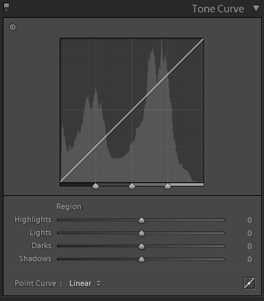
The Tone Curve Panel in Lightroom's Develop module is a provision for more precise tonal and contrast control of our photos. Like all Develop module panels, the Tone Curve Panel is found on the right hand side of the Lightroom window, just below the Basic panel. The top part of the panel is taken up by the graph of the curve itself. Just below we have the "Region" and "Point Curve" subpanels. The picture is completed by the "dragging" tool at the top left and the "Click to Edit" tool at the bottom right.
To get started it is important to "read" the tonal curve and understand how its modifications affect our photos. Here are some basics:
- The tonal curve is a graph of the contrast in our photo. It starts from completely black pixels on the left and ends at completely white pixels on the right. Notice that Lightroom faintly portrays the photo's histogram in the background.
- To make life easier, Lightroom divides the curve in four regions labeled as Highlights, Lights, Darks and Shadows. The three dividers on the horizontal axis are the cut-off points for these regions. By default they lie at 25%, 50% and 75% luminosity levels, moving them left/right makes the four regions "broader" or "narrower".
- The gradient of the line signifies contrast in a particular region. By default we always start from a linear line with uniform contrast for all luminance levels. A steep part of the curve signifies a high contrast region, while a flat part of the curve signifies a low contrast region.
- Although explanations of basic photographic theory are beyond the scope of this series of Lightroom how-to articles, it is important to keep the curve always rising (or completely flat in the worst case) as we move from left to right. A dipping curve will disrupt normal order and end up in some weird funky effects.
Lightroom provides for different styles of tonal adjustments and different levels of freedom. To make things easier and in order to go through the different adjustments, I will describe four different tonal curve editing methods that I highly recommend trying and learning:
Method 1 - Move regional sliders
By default Lightroom starts from a linear tonal curve and offers the use of the Highlight, Lights, Darks and Shadows sliders. As shown in the examples below, hovering your pointer above any of those sliders highlights the boundaries of modifications to be effected on the curve:


Notice that when the tonal sliders are adjusted, Lightroom takes care of smoothing out the curve by implementing gentle transitions with neighboring regions. For this reason I highly recommend this as the tonal method of preference for beginners.
Method 2 - Point curve presets
The Point Curve sub-panel at the bottom of the Tone Curve panel contains a dropdown menu with Linear, Medium and Strong contrast presets. If you are new to the panel, the medium and strong contrast presets represent very effective settings that you can also tune via the sliders explained in method 1. The example below shows the same photo in Linear, Medium and Strong tonal contrast mode:


Simplicity and easy combination with method 1 make tonal presets a very attractive proposition for beginners.
Method 3 - Adjustments by dragging on the photo
The dragging tool is a very handy semi-automatic adjustment if you want to adjust locally in certain regions of the photo. By clicking on the tool (top left of the Tone Curve panel) your pointer turns into a circle with two arrows. Now you can click and drag up to lighten or down to darken. In my example, although I was happy with the strong contrast curve I wanted to even out the tones for overall balance. I also addressed the extreme over-saturation of the skin and suit jacket. Notice the new bump in the curve, representing the crushed highlights, lowered darks, and bump in lights and shadows.

Method 4 - Manual point curve editing
Click the Point Curve Editing tool at the bottom right of the Tune Curve panel and the regional sliders will disappear. You can now click, define and adjust any point directly on the curve. This method provides the highest level of freedom and intricate detail. It is not susceptible to the boundaries existing in the three previous methods. As demonstrated in my example, I decided to bring back punchiness but in a way that appeared more stylistic. I was able to pull all focus to the floral boutonniere and give an overall modern-film look by pulling up the black point to a higher luminosity on the vertical axis, while maintaining a strong contrast and crushing highlights.

A great feature in point curve mode is that we can access RGB channels. Since blue is so dominate in our example, I chose to further boost contrast and pull back slightly on some of the darks and shadows in the blue channel to arrive at a more pleasant result:

Manual curve editing is "riskier" than previous methods as it does not comply with boundaries. It can however be very effective and rewarding.
The tone curve is a feature often overlooked by many photographers. For quick quality results you can apply presets like the "Color & Contrast" presets of the Luxe Essentials Collection or by creating simple ones representing your personal preferred style. In any case, if you have gone through adjustments and there is something still missing from the result, tonal adjustments might be key to achieving that crucial final touch.


